Rotate Clothing Co.
Visual Identity
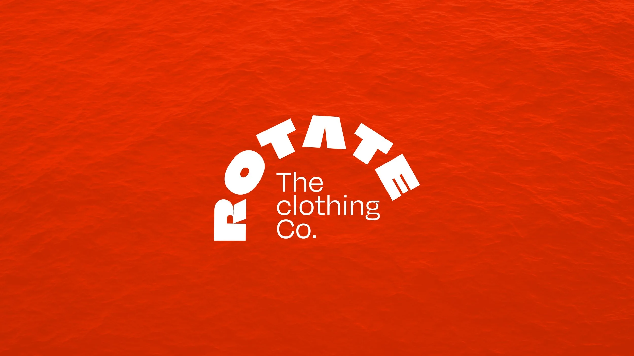
Objective
To design a high-impact, typographic-driven logo for an Indian-based
t-shirt brand that captures the spirit of constant movement and streetwear culture.
Design Strategy
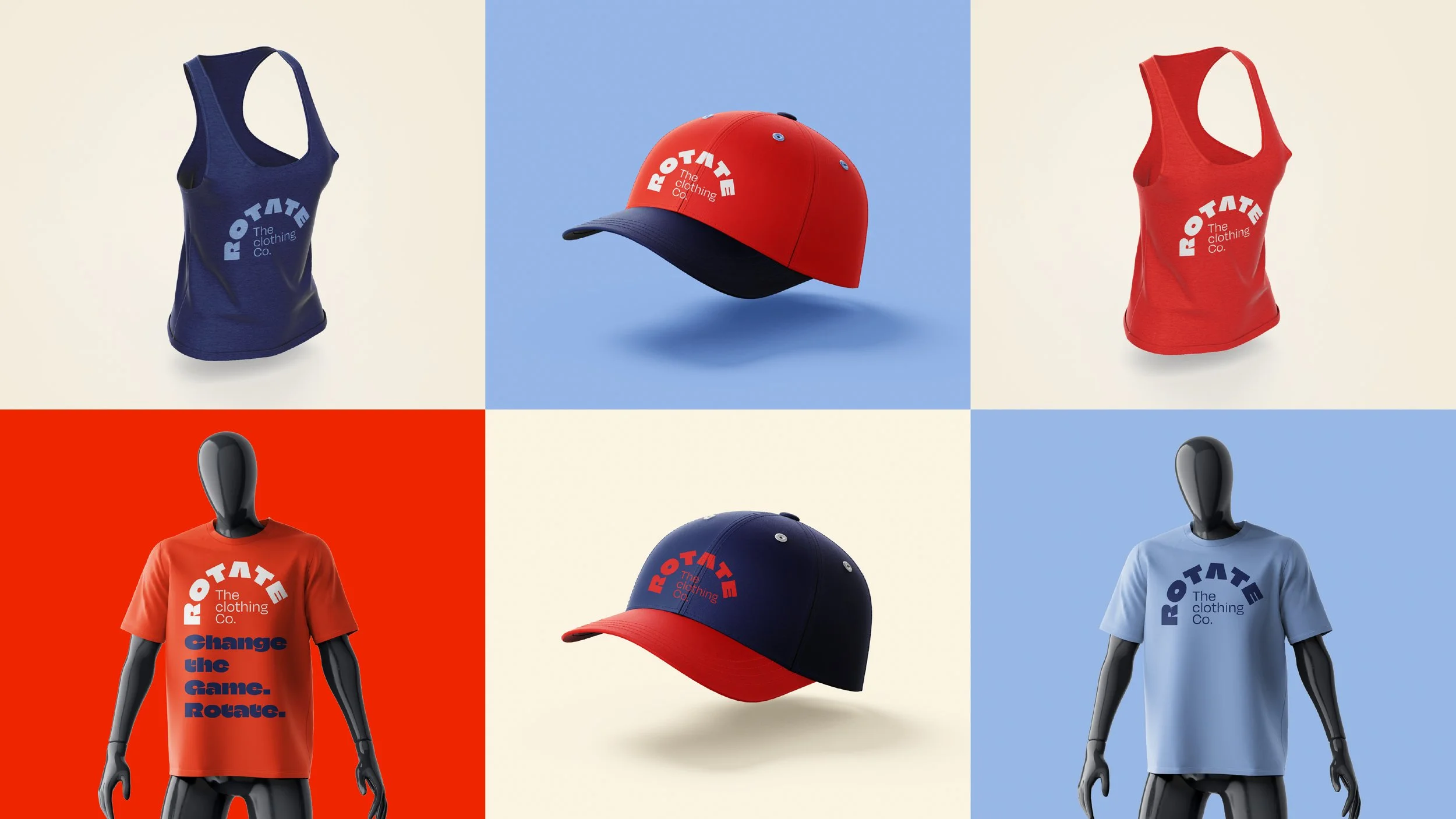
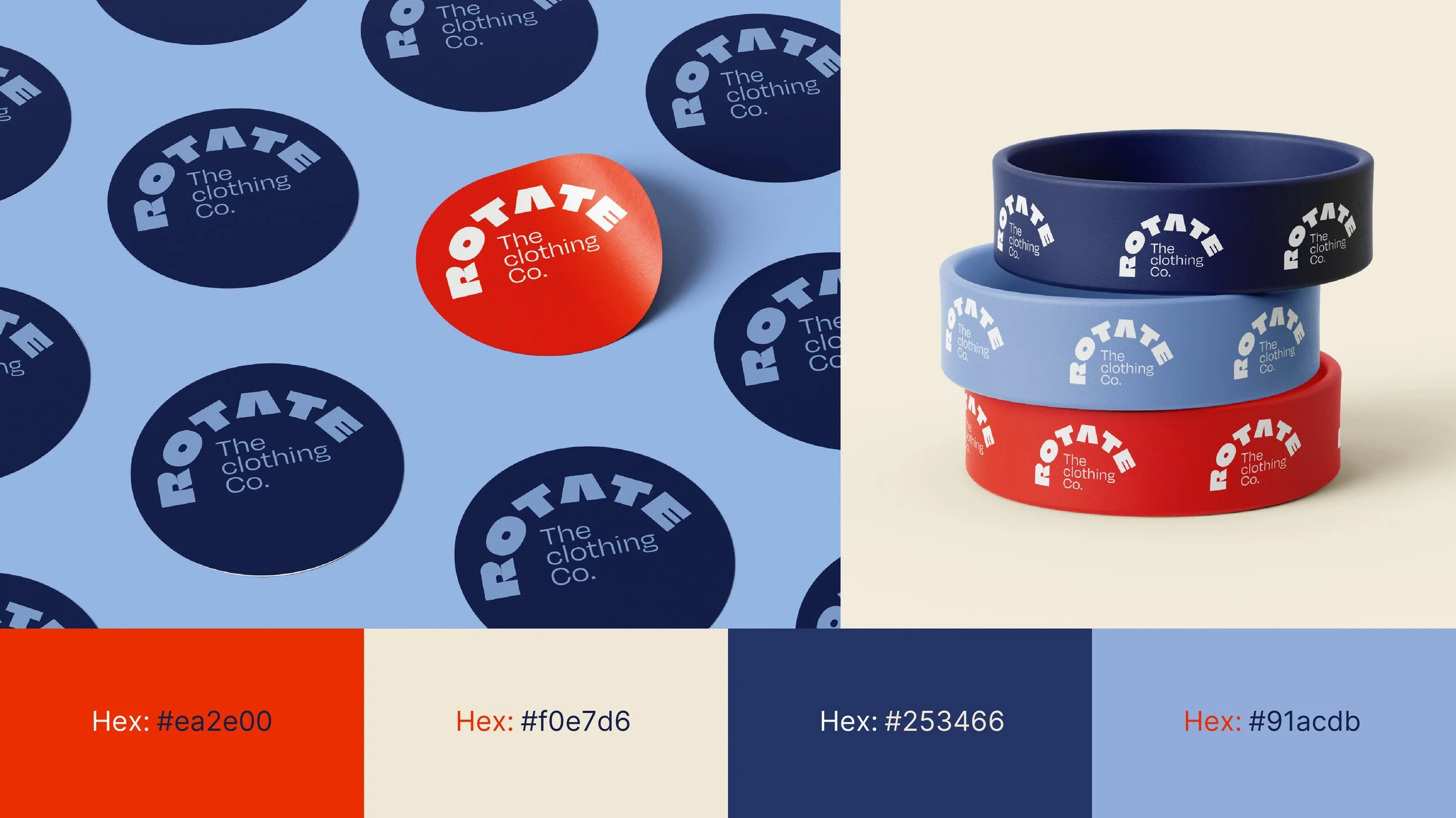
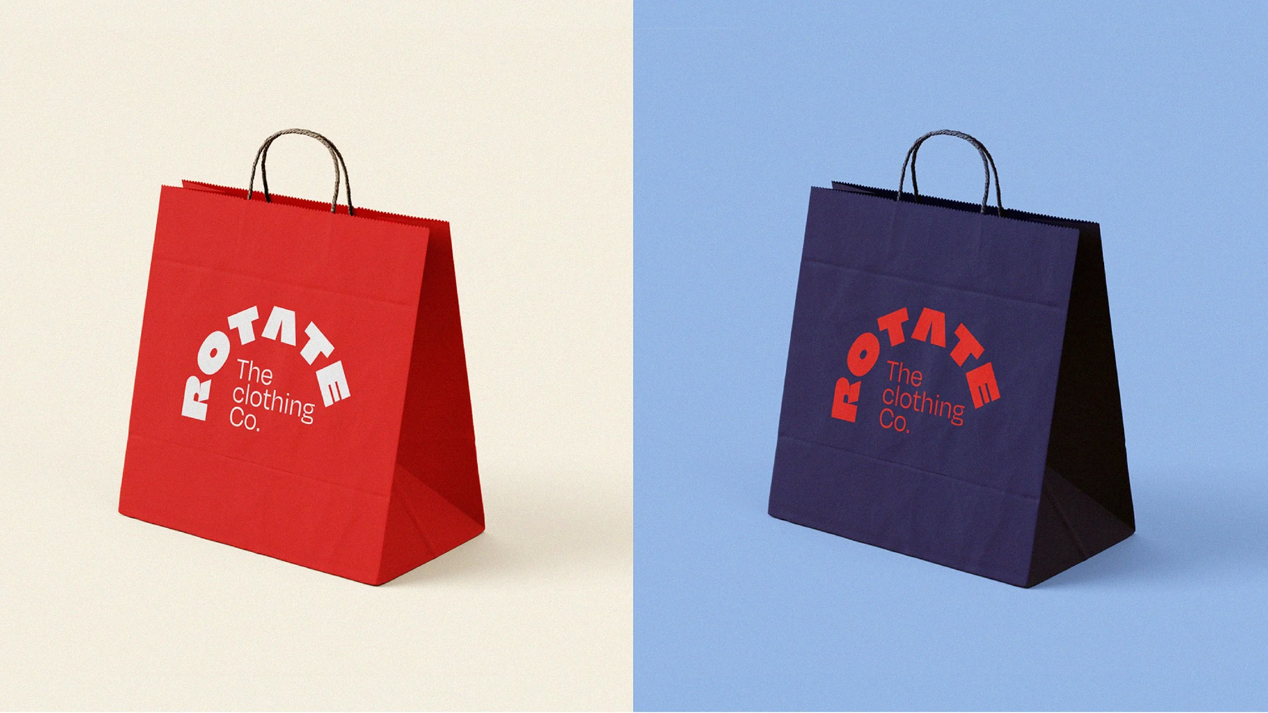
The core of the identity lies in the heavy, blocky letterforms that create a sense of structural stability, while the radical arched "ROTATE" wordmark introduces dynamic tension. By contrasting the massive, custom-distorted header with a clean, modern sans-serif for "The clothing Co.", the design achieves a balance between "loud" street aesthetic and "refined" lifestyle branding. The warm, red palette was selected to stand out in a digital-first market while remaining versatile for screen printing and embroidery.
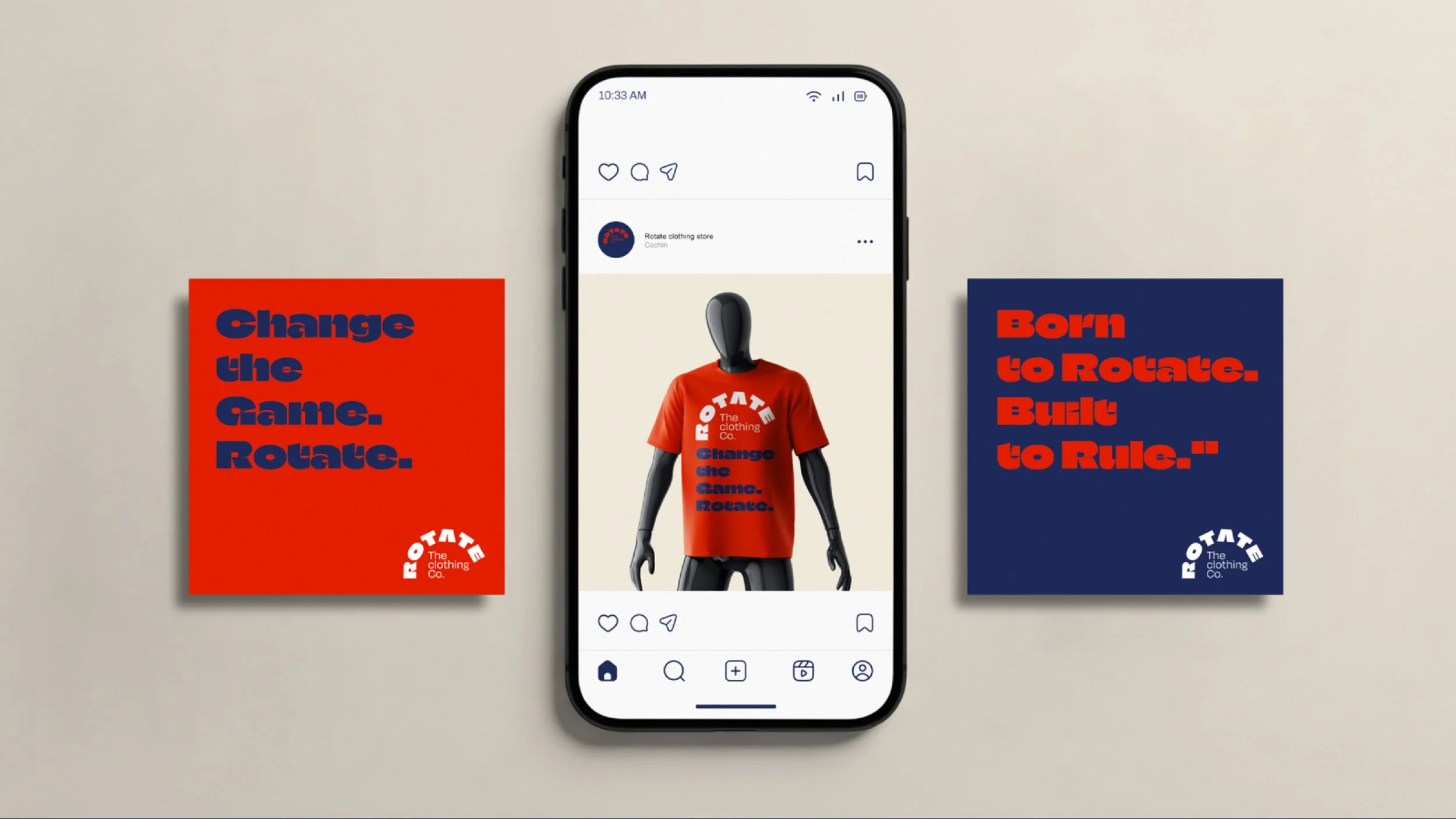
Big type, bigger energy. Our signature arch logo represents the evolution of the classic Indian tee. Built to stand out, designed to rotate."